A storefront is often the first impression that a brick and mortar brand makes on potential customers. People driving or walking past a store often can’t see inside, so businesses need to tell passersby something about their brand to get them in the door. That’s why it’s crucial to brand a store from the outside in. Bold, clear signage, creative window displays, and façade design including everything from color to awnings are key for making your storefront pop. Read on for design tips and to see examples of storefronts we love.
1. Work with a building’s unique design elements, such as the cornice, molding and windows to accentuate its natural charm. Paint them an accent color or illuminate them during evening hours. Highlighting these distinctive components preserves a building’s historic elements and enhances its character.
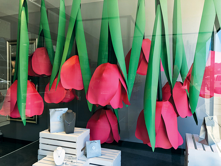
2. Effective window displays that are fun and creative, well lit, and consistently updated can increase a business’s foot traffic by about 20 percent. Displays should not be over-cluttered or block one’s view into the store.
3. Awnings can be used to add dimension, balance and symmetry to a store’s façade. They provide a great template for incorporating a brand’s logo or color scheme. Be sure to replace them when they become stained, faded or torn. A well maintained awning provides a professional, updated look.
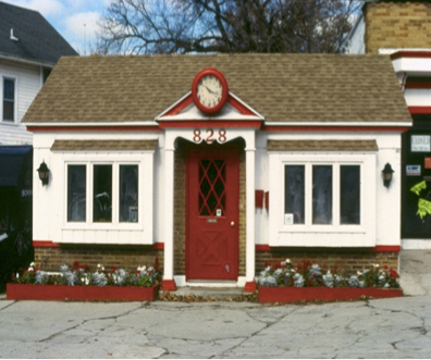
4. A fresh coat of paint can always enhance a storefront. A bold splash of paint color from your brand’s color palette can provide an element of personality. But remember, when choosing storefront colors, less is often more – one or two statement-making pops of color can go a long way. Often just painting your front door, window trim, and window boxes/planters, can make your storefront stand out. (Be sure to check with your landlord and/or local community’s design committee before buying the paint as some cities have strict paint palettes to abide by, especially if you’re in a historic building.)
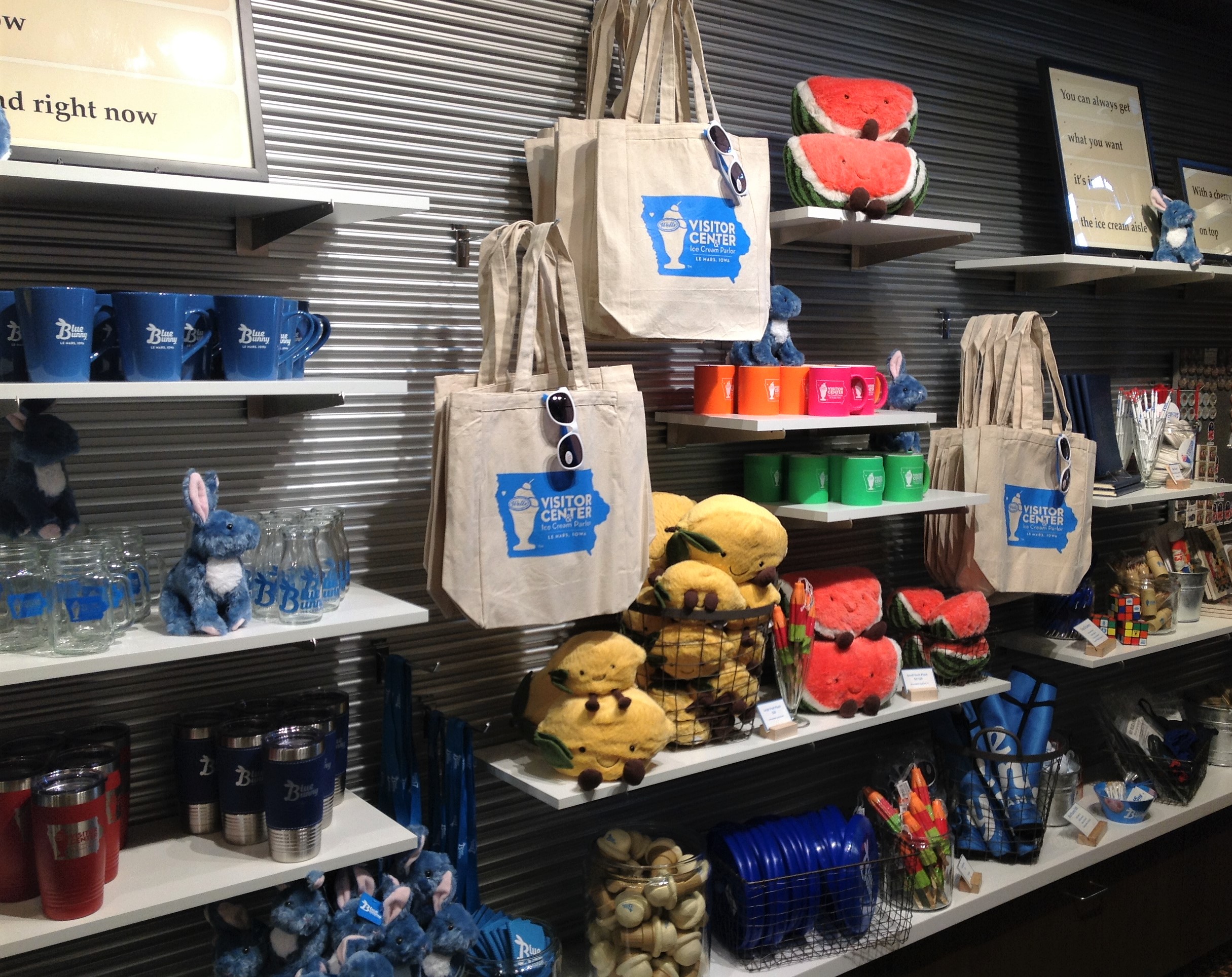
5. A store’s signage should reflect the essence of its brand while still remaining in scale with the façade. Keep signs simple with fewer words and more symbols or graphics, because customers will not read a lot. Be sure to display logos at eye level for pedestrian traffic, and also high on the façade for auto traffic. For additional help with choosing effective signage, check out our Sign Design Guidelines.
Retailworks can help with storefront design for a stand-alone business or an entire main street. Visit our website or contact us for more information.


